Factfulness
“I want people, when they realize they have been wrong about the world, to feel not embarrassment, but that childlike sense of wonder, inspiration, and curiosity that I remember from the circus, and that I still get every time I discover I have been wrong…” Hans Rosling, Factfulness, 2018
Earlier this year I read “Factfulness” by Hans Rosling, Ola Rosling and Anna Rosling Rönnlund, having come across Hans Rosling in the BBC documentary “The Joy of Stats”. His love of stats and data, and animated data visualisations really inspired me, and dove-tailed nicely with my recent journey into the world of R and the tidyverse.
I thought, what better way to emulate my new stats hero, whilst also developing my R skills, by recreating (and then animating!) one of the plots in the book. This was the first “proper” project I’d undertaken in R, after dipping my toes into the weekly #TidyTuesday challenges on Twitter (which are great by the way, for anyone just starting out with R). I had been learning R for about 6 months at this point, and this post is aimed at anyone similarly new to the wonderful world of R, with an interest in the tidyverse packages.
The Goal
The graphs I’m attempting to lovingly replicate can be found on pages 25 and 26. They are concerned with the survival rates of under 5s and the number of babies per women for countries across the world. The first plot (on page 25) shows these 2 measures as of 1965 (although cunningly does not display the year), and the second plot (on page 26) updates these for 2017. In true Hans Rosling style, I wanted to animate the movements over that time period. Watch the beginning of this TED video to see the master himself at work. It beautifully illustrates how a binary world view of ‘developed’ vs ‘developing’ or ‘West’ vs ‘The Rest’ is now an antiquated notion. This is the theme that runs right through “Factfulness”.

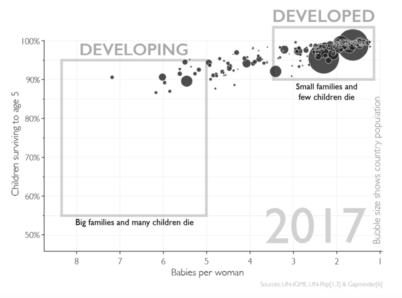
Just to make it clear, this is not so much about getting the data super accurate or recreating the graphs exactly (you’ll notice that the final output does differ from Rosling’s). It was more an exercise in implementing the tools and techniques I’d been learning in R. It provides the opportunity to extract, clean, tidy, manipulate and visualise data, which form the basis of any data analysis. It is also my small tribute to Hans Rosling, who I discovered far too late, as he sadly passed away in February 2017.
Getting started
First, load the packages. I’ll need readxl (for reading in data from excel spreadsheets), tidyverse (for nearly everything), scales (handy for formatting axis labels) and gganimate (yes, for animating!).
library(readxl)
library(tidyverse)
library(scales)
library(gganimate)
Obtaining the data
According to the sources in Factfulness, the data comes from 3 places: the UN Inter-agency Group for Child Mortality Estimation, UN World Population Prospects 2017 and Rosling’s own Gapminder.
To simplify my job, I’ve decided to get everything from the UN WPP 2017 handy Download Centre. As I’ve said, I’m not looking to recreate the data exactly, and I didn’t want to spend too much time trying to rigorously validate my data with that used in the book.
The Download Centre stores excel workbooks on the 3 measurements I’m after: the Mortality Rates for under 5s, Fertility Rates and Total Populations. Using the read_excel function, I’ve identified the cells required in each workbook and only imported that selection.
cm <- read_excel("data/WPP2017_MORT_F01_2_Q5_BOTH_SEXES.xlsx", sheet = "ESTIMATES", range = "C17:R258")
fr <- read_excel("data/WPP2017_FERT_F04_TOTAL_FERTILITY.xlsx", sheet = "ESTIMATES", range = "C17:R258")
pop <- read_excel("data/WPP2017_POP_F01_1_TOTAL_POPULATION_BOTH_SEXES.xlsx", sheet = "ESTIMATES", range = "C17:BS290")
Let’s take a look at the data. glimpse from the dplyr is great for inspecting data, along with the bog-standard head function (I’ll only show the first dataframe for brevity):
glimpse(cm)
head(cm)
tail(cm)
## Observations: 241
## Variables: 16
## $ `Region, subregion, country or area *` <chr> "WORLD", "More develope...
## $ Notes                                  <chr> NA, "a", "b", "c", "d",...
## $ `Country code`                         <dbl> 900, 901, 902, 941, 934...
## $ `1950-1955`                            <dbl> 214.93169, 76.93226, 24...
## $ `1955-1960`                            <dbl> 195.54164, 52.96041, 22...
## $ `1960-1965`                            <dbl> 183.84255, 38.71206, 21...
## $ `1965-1970`                            <dbl> 157.29120, 30.84459, 17...
## $ `1970-1975`                            <dbl> 138.68593, 25.32164, 15...
## $ `1975-1980`                            <dbl> 124.25205, 21.78994, 13...
## $ `1980-1985`                            <dbl> 108.98806, 18.26712, 12...
## $ `1985-1990`                            <dbl> 96.37167, 15.70424, 106...
## $ `1990-1995`                            <dbl> 90.79759, 12.71341, 100...
## $ `1995-2000`                            <dbl> 82.380026, 10.419288, 9...
## $ `2000-2005`                            <dbl> 70.054329, 8.824500, 76...
## $ `2005-2010`                            <dbl> 57.611039, 7.405042, 63...
## $ `2010-2015`                            <dbl> 48.145403, 6.251860, 52...
## # A tibble: 6 x 16
##   `Region, subreg… Notes `Country code` `1950-1955` `1955-1960` `1960-1965`
##   <chr>            <chr>          <dbl>       <dbl>       <dbl>       <dbl>
## 1 WORLD            <NA>             900       215.        196.        184.
## 2 More developed … a                901        76.9        53.0        38.7
## 3 Less developed … b                902       248.        228.        212.
## 4 Least developed… c                941       324.        296.        272.
## 5 Less developed … d                934       237.        218.        203.
## 6 Less developed … <NA>             948       268.        238.        214.
## # ... with 10 more variables: `1965-1970` <dbl>, `1970-1975` <dbl>,
## #   `1975-1980` <dbl>, `1980-1985` <dbl>, `1985-1990` <dbl>,
## #   `1990-1995` <dbl>, `1995-2000` <dbl>, `2000-2005` <dbl>,
## #   `2005-2010` <dbl>, `2010-2015` <dbl>
## # A tibble: 6 x 16
##   `Region, subreg… Notes `Country code` `1950-1955` `1955-1960` `1960-1965`
##   <chr>            <chr>          <dbl>       <dbl>       <dbl>       <dbl>
## 1 Kiribati         <NA>             296       213.        198.        173.
## 2 Micronesia (Fed… <NA>             583       139.        123.        108.
## 3 Polynesia        30               957       132.        111.         97.9
## 4 French Polynesia <NA>             258       142.        108.         95.4
## 5 Samoa            <NA>             882       160.        142.        125.
## 6 Tonga            <NA>             776        79.7        70.4        61.7
## # ... with 10 more variables: `1965-1970` <dbl>, `1970-1975` <dbl>,
## #   `1975-1980` <dbl>, `1980-1985` <dbl>, `1985-1990` <dbl>,
## #   `1990-1995` <dbl>, `1995-2000` <dbl>, `2000-2005` <dbl>,
## #   `2005-2010` <dbl>, `2010-2015` <dbl>
So the child mortality and fertility metrics are only given in 5-year time periods, and they end in 2015. Ideally I would’ve liked data for every year, but I’m not going to get too hung up on that and just work with what I have.
I’m also slightly concerned about merging on country name, just in case they are not consistent across the 3 files. But notice there is a country code variable, and the UN also provides a list of standard country codes. This will certainly help things, I’ll read this in too, and tidy it up a bit.
codes <- read_csv("data/UNSD — Methodology.csv")
country_codes <- codes %>%
  select(country_code = `M49 Code`, ISO_code = `ISO-alpha3 Code`, region = `Region Name`) %>%
  mutate(country_code = as.integer(country_code))

head(country_codes)
## # A tibble: 6 x 3
##   country_code ISO_code region
##          <int> <chr>    <chr>
## 1           12 DZA      Africa
## 2          818 EGY      Africa
## 3          434 LBY      Africa
## 4          504 MAR      Africa
## 5          729 SDN      Africa
## 6          788 TUN      Africa
Note I’ve pulled back region name (i.e. continent) here too. This will enable me to colour the bubbles in my plot later on.
Tidying the data
Now that I have the data I need, it’s time to get tidying. The data is currently in a wide format, with each record holding the country or area, and each column representing the year (or time period). To make the plot I’m going to need the data in a long format (i.e. a record for each country and year combination). This type of data manipulation is what the gather function was made for (see spread for achieving the opposite, both from the tidyr package). Here’s the tidying of the fertility data:
fertility <- fr %>%
  select(-Notes) %>%
  rename(country_code = `Country code`, country = `Region, subregion, country or area *`) %>%
  gather(key = "year_range", value = "fertility", -c(country_code, country)) %>%
  mutate(year = as.integer(str_sub(year_range,6,9))) %>%
  filter(year >= 1965)

head(fertility, 5)
tail(fertility, 5)
## # A tibble: 5 x 5
##   country                          country_code year_range fertility  year
##   <chr>                                   <dbl> <chr>          <dbl> <int>
## 1 WORLD                                     900 1960-1965       5.03  1965
## 2 More developed regions                    901 1960-1965       2.66  1965
## 3 Less developed regions                    902 1960-1965       6.15  1965
## 4 Least developed countries                 941 1960-1965       6.72  1965
## 5 Less developed regions, excludi…          934 1960-1965       6.07  1965
## # A tibble: 5 x 5
##   country                     country_code year_range fertility  year
##   <chr>                              <dbl> <chr>          <dbl> <int>
## 1 Micronesia (Fed. States of)          583 2010-2015       3.33  2015
## 2 Polynesia                            957 2010-2015       2.97  2015
## 3 French Polynesia                     258 2010-2015       2.07  2015
## 4 Samoa                                882 2010-2015       4.16  2015
## 5 Tonga                                776 2010-2015       3.79  2015
Now my data is thinner, with a year_range variable created that takes the year ranges that were appearing as columns. And a fertility variable that takes the corresponding values from the year ranges. To deal with the 5-year periods, I’m just going to take the latest year in each period. Again, not the most rigorous aproach, but onwards!
I’ll then do something similar for the child mortality and population data:
child_mort <- cm %>%
  select(-Notes) %>%
  rename(country_code = `Country code`, country = `Region, subregion, country or area *`) %>%
  gather(key = "year_range", value = "childmort", -c(country_code, country)) %>%
  mutate(year = as.integer(str_sub(year_range,6,9)),
         child_surv_rate = (1000 - childmort)/1000) %>%
  filter(year >= 1965)

head(child_mort, 5)
count(child_mort, year)

population <- pop %>%
  select(-Notes) %>%
  rename(country_code = `Country code`, country = `Region, subregion, country or area *`) %>%
  gather(key = "year", value = "population", -c(country_code, country)) %>%
  mutate(year = as.integer(year),
         population = population*1000) %>%
  filter(year %in% seq(1965, 2015, 5))

head(population, 5)
count(population, year)
## # A tibble: 5 x 6
##   country          country_code year_range childmort  year child_surv_rate
##   <chr>                   <dbl> <chr>          <dbl> <int>           <dbl>
## 1 WORLD                     900 1960-1965      184.   1965           0.816
## 2 More developed …          901 1960-1965       38.7  1965           0.961
## 3 Less developed …          902 1960-1965      212.   1965           0.788
## 4 Least developed…          941 1960-1965      272.   1965           0.728
## 5 Less developed …          934 1960-1965      203.   1965           0.797
## # A tibble: 11 x 2
##     year     n
##    <int> <int>
##  1  1965   241
##  2  1970   241
##  3  1975   241
##  4  1980   241
##  5  1985   241
##  6  1990   241
##  7  1995   241
##  8  2000   241
##  9  2005   241
## 10  2010   241
## 11  2015   241
## # A tibble: 5 x 4
##   country                                    country_code  year population
##   <chr>                                             <dbl> <int>      <dbl>
## 1 WORLD                                               900  1965     3.34e9
## 2 More developed regions                              901  1965     9.67e8
## 3 Less developed regions                              902  1965     2.37e9
## 4 Least developed countries                           941  1965     2.71e8
## 5 Less developed regions, excluding least d…          934  1965     2.10e9
## # A tibble: 11 x 2
##     year     n
##    <int> <int>
##  1  1965   273
##  2  1970   273
##  3  1975   273
##  4  1980   273
##  5  1985   273
##  6  1990   273
##  7  1995   273
##  8  2000   273
##  9  2005   273
## 10  2010   273
## 11  2015   273
Joining the data
Now I have all the data in a tidy format, it’s time to bring it all together into 1 dataset that I can then use in my plot. As mentioned earlier, I’m going to join using the country code, rather than the name, as this will be consistent and should lead to a better match. Also, the country_codes dataset only contains the codes of countries, and not regions or areas, so will result in these non-country records being lost, which is what I want. I’m going to join using the inner_join function from the dplyr package so only countries appearing in all 4 datasets are retained. I’m also filtering out any records where one of the key metrics is missing as this can’t be plotted anyway.
df <- child_mort %>%
  inner_join(country_codes, by = "country_code") %>%
  inner_join(fertility, by = c("country_code", "year")) %>%
  inner_join(population, by = c("country_code", "year")) %>%
  filter(!is.na(fertility), !is.na(child_surv_rate), !is.na(population))

glimpse(df)
## Observations: 2,189
## Variables: 13
## $ country.x       <chr> "Burundi", "Comoros", "Djibouti", "Eritrea", "...
## $ country_code    <dbl> 108, 174, 262, 232, 231, 404, 450, 454, 480, 1...
## $ year_range.x    <chr> "1960-1965", "1960-1965", "1960-1965", "1960-1...
## $ childmort       <dbl> 251.19816, 249.26511, 221.86015, 269.99234, 26...
## $ year            <int> 1965, 1965, 1965, 1965, 1965, 1965, 1965, 1965...
## $ child_surv_rate <dbl> 0.7488018, 0.7507349, 0.7781399, 0.7300077, 0....
## $ ISO_code        <chr> "BDI", "COM", "DJI", "ERI", "ETH", "KEN", "MDG...
## $ region          <chr> "Africa", "Africa", "Africa", "Africa", "Afric...
## $ country.y       <chr> "Burundi", "Comoros", "Djibouti", "Eritrea", "...
## $ year_range.y    <chr> "1960-1965", "1960-1965", "1960-1965", "1960-1...
## $ fertility       <dbl> 7.0710, 6.9090, 6.5470, 6.8150, 6.8972, 8.0650...
## $ country         <chr> "Burundi", "Comoros", "Djibouti", "Eritrea", "...
## $ population      <dbl> 3077876, 207424, 114963, 1589179, 25013626, 95...
Now I have a nice dataset in the format i want, ready for visualising!
Visualising the data
This is where the fun happens. To replicate the plot as best I could, I took just the 1965 data and created a static plot to get the themes and annotation just so. The code required to then animate the plot is surprisingly brief thanks to Thomas Lin Pedersen’s gganimate package (which was released in its latest incarnation on GitHub earlier this year). You’ll need to download it from Github using the devtools package. I’ve become slightly obsessed with it, and have to resist the urge to animate every plot I make.
Before I get to the plot itself, there are 2 preliminary steps I’ll take. Although the plots I’m recreating are in black-and-white, I’m going to colour them based on the palette used in the plot just inside the front cover to Factfulness:
cols <- c("Africa" = "blue", "Americas" = "green", "Asia" = "red", "Europe" = "yellow", "Oceania" = "purple")I also want to label the plots with the year in question. The gganimate package does provide {frame_time} which can be added to labels (e.g. title) to display the time period as the frames progress. However, I want to display the year in the bottom right of the plot to replicate the 2017 plot on page 26 of the book. To do this I have created a data frame to be used in the geom_text function. This was the biggest sticking point I had in getting the plot how I wanted it. I wanted the plot to transition through each year from 1965 - 2015, despite only having data in 5 year intervals, and for the relevant year to be displayed. So I’m creating the below dataframe of the 51 years in that time period, and then when it comes to initiating the animation, I’ll specify that I need 51 frames. This does mean that the years in between the 5-year intervals are just really joining the dots and not the true data for each intermediary year being shown.
year_lab <- data_frame(year = as.integer(seq(1965, 2015, 1)), fertility = 2.5, child_surv_rate = 0.55)Now I can finally plot!
I’ll skip straight to the fully animated plot. I save it first to object p so I can then render it afterwards with some specified arguments:
p <- ggplot(df, aes(x = fertility, y = child_surv_rate)) +
  geom_point(aes(size = population, fill = region),
             alpha = 0.8, shape = 21, colour = "white") +
  scale_fill_manual(values = cols) +
  scale_size(range = c(2, 20), guide = FALSE) +
  scale_x_reverse(breaks = seq(1,8,1), labels = seq(1,8,1)) +
  scale_y_continuous(limits = c(0.5,1.025), breaks = seq(0.5,1,0.1),
                     labels = scales::percent(seq(0.5,1,0.1))) +
  annotate("rect", xmin = 5, xmax = 8.3, ymin = 0.55, ymax = 0.95,
           fill = NA, colour = "grey", size = 1.5) +
  annotate("rect", xmin = 1, xmax = 3.5, ymin = 0.9, ymax = 1.01,
           fill = NA, colour = "grey", size = 1.5) +
  annotate("text", x = 6.65, y = 0.97, label = "DEVELOPING",
           size = 10, colour = "grey", fontface = 2) +
  annotate("text", x = 2.25, y = 1.025, label = "DEVELOPED",
           size = 10, colour = "grey", fontface = 2) +
  annotate("text", x = 6.65, y = 0.53, label = "Big families and many children die",
           size = 5, colour = "black", fontface = 2) +
  annotate("text", x = 2.25, y = 0.87, label = "Small families and\nfew children die",
           size = 5, colour = "black", fontface = 2) +
  annotate("text", x = 1.1, y = 0.5, label = "Bubble size shows country population",
           size = 5, colour = "grey", angle = 90, hjust = 0) +
  geom_text(data = year_lab, aes(x = fertility, y = child_surv_rate, label = year),
            size = 30, colour = "grey") +
  transition_time(year) +
  ease_aes('linear') +
  labs(x = "Babies per woman", y = "Children suviving to age 5",
       title = NULL,
       caption = "SOURCE: UN Population Division, World Population Prospects 2017") +
  theme_minimal() +
  theme(panel.grid.minor.x = element_blank(),
        axis.line = element_line(colour = "black", size = 0.3),
        axis.ticks = element_line(size = 0.3),
        axis.ticks.length = unit(.1, "cm"),
        axis.text = element_text(size = 12),
        axis.title = element_text(size = 14),
        legend.position = c(0.78, 0.4),
        legend.title = element_blank(),
        legend.text = element_text(size = 18),
        legend.background = element_rect(fill = "white"),
        plot.title = element_text(size = 22, face = "bold"),
        plot.subtitle = element_text(size = 20))
Most of this will be familiar to anyone with a little ggplot2 experience. I’m using annotate to create the rectangles and add the text, with the changing year label added using geom_text. I’ve deviated slightly from the original plots by adding a legend for the coloured continents, but apart from that I’ve tried to stay as true to the original as I could.
The gganimate part is just 2 lines. There is transition_time to indicate that the frames should transition by the year variable, and ease_aes specifying that the transition should be linear. Other transitions are available should you be transitioning through a categorical variable. Definitely check out the gganimate wiki for some great examples of it in action.
I now have the plotting object that can be animated. I was finding that the default nframes was too high and this was causing the year label to sometimes display decimal places which is not what I wanted, so I’m setting the number of frames to match the number of years.
animate(p, width = 900, height = 600, nframes = 51, fps = 4)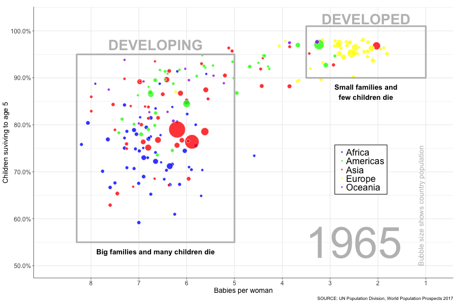
Closing
And there it is, the progress of the world (based on 2 measures at least) flashing before your eyes in a matter of seconds. I like to watch it whilst willing those bubbles in the bottom left into the top right. Go bubbles, go! It’s fun, try it yourself! OK, I took a few shortcuts when it came to replicating the data exactly (so world leaders please refrain from taking this graph as gospel), but I was just itching to see my idea through from start to finish. In doing so I feel like I progressed my R skills and learnt plenty of new things, so success! I’ve undertaken several other projects in the meantime which I will be writing up soon, so watch this space!
Thanks for reading, I hope you enjoyed me putting the “R” into “Hans Rosling”!